Visualising the DigitalNZ metadata ecosystem
Posted on 15 September 2013 by Thomasin
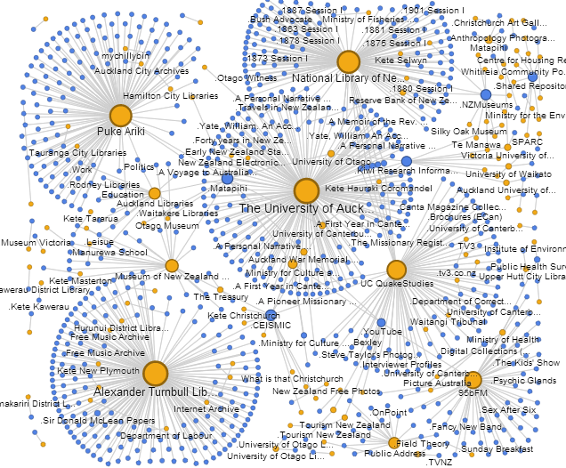
This blog post details an interactive visualisation of DigitalNZ data, which you can experiment with as a Google Fusion Table. Note that by default the visualisation will only show about 150 nodes. Increase the number of nodes to the maximum value to see everything. Read on to learn more.

At the time of writing, DigitalNZ works with 140 content providers to make New Zealand digital content easier to find, share and use. This is a far cry from the handful of institutions we harvested metadata from when the initiative began four and a half years ago. This post shares some work we’ve been doing to understand the scale and structure of the intricate network of institutions and collections we harvest metadata from.
Some notes on data modelling
Data modelling involves wrangling the messiness of a real-world domain into an explicit structure, ideally using just a handful of mathematical building blocks. Ambiguous concepts and phenomena get shoehorned into precise logical representations. Soil landscapes become sets of polygons, friendships become network graphs, books become word frequency hash-tables. The modeller strives for elegance, but there is always tension between the competing virtues of simplicity and comprehensiveness. In the future, anthropologists might infer surprising things about our institutional values from the data models we create.
A record is the fundamental element in the DigitalNZ data schema. Each record holds the metadata that describes a photograph, map, newspaper article, video or some other item out there in the world. A record is associated with content partners and collections. Where a record is associated with multiple content partners, or part of multiple collections, we specify a primary content partner or primary collection. This model is simple but it works for us. Sometimes I want to introduce more nuanced concepts such as an “aggregation”, for services like Matapihi, or “platform” for places like YouTube and Flickr, but I fear that way madness lies.
In summary, each record is associated with one or more content partners and is part of one or more collections. The rest of this post outlines a visualisation exercise I undertook to get a sense of how all the content partners and collections fit together.
Nodes and edges
To visualise our partner data I created a Google Fusion Table where each row contains a unique combination of a content partner, a primary collection and a collection. Collections vary hugely in size. The largest collection that we store metadata for is the Evening Post from the National Library's Paper's Past service, consisting of 3.6 million historical newspaper articles. Our smallest collections contain only a single item. To simplify the graphics, I filtered out all collections containing fewer than five items.
Fusion tables can transform structured data into network-graph visualisations. Cells from a pair of related table fields get plotted as nodes connected by common edges. In the diagrams in this blog post, orange nodes are content partners and blue nodes represent collections of metadata records.
We've made the network visualisation publicly accessible. It should be fine in modern browsers, but I'm afraid it will struggle on older applications. I invite you to play with it and get a sense of what it is that we do.
By default, the visualisation will only show about 150 nodes. If you increase that number to the maximum (712 at the time of writing) then you will see previously hidden collections and partners burst onto the canvas like fireworks. Remember, orange nodes stand for content partners while blue nodes represent collections of metadata records. Read on for commentary.
Sometimes the relationships are straightforward. For example, our Kete Horowhenua partner has a single collection, which is also called Kete Horowhenua.

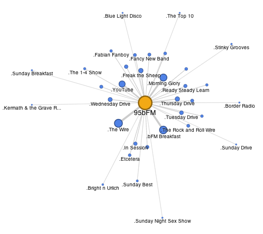
Contrast that simple scenario to the University of Auckland's student radio station, 95bFM. Over the years, we've harvested metadata describing the station’s various different broadcasts through its RSS feed, treating each show as a collection. The chart below presents this data as a graph, sizing the circles proportional to the number of broadcasts we've harvested for each show.

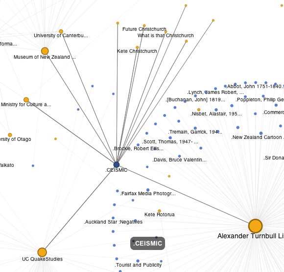
In other places the web of relationships between partners and collections is wonderfully intricate. For example, some collections are composed of contributions from multiple institutions. For example, the University of Canterbury CEISMIC collection draws together materials from a host of other organisations, including the Ministry for Culture and Heritage, Te Papa, Alexander Turnbull Library and a host of local initiatives.

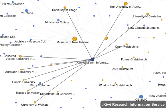
A similar pattern can be seen in the NZResearch.org collaboration between New Zealand tertiary institutions.

What's the point?
I created this visualisation primarily to help the DigitalNZ team understand how our various metadata sources are structured and related. We work with this data every day and we have developed mental maps of these landscapes. However, these understandings were personal, imprecise and inevitably riddled with blind spots. Representing our content partners as a network graph provides a shared vision of the scale and structure of our metadata sources, including the connections between institutions and collections.
I wanted to make something that would enable my colleagues to gather around a monitor. It is useful for me to be able to point at a screen and say, "see how these institutions are connected through this chain of collections", confident that the person I am speaking with is also on the page. We are already finding patterns we didn’t know existed, noticing gaps and spotting small errors. Developing a clear shared understanding is invaluable when there is so much potential for small issues to get lost in the complexity of the system. This visualisation also allows us to open up the discussion to our content partners and users. If you see a gap or an omission, or something doesn't look quite right, we'd love to hear from you via @DigitalNZ or info@digitalnz.org.nz.
It also helps us tell our story better. People sometimes ask us what we actually do and such questions can be a little hard to answer. Visualisations like this help explain the scope and scale of what DigitalNZ is while also hinting at the treasures that lie within.
Comments
Comments have been closed for this post
Cracking post, you make it look very easy.
--Chris • 2013-09-16 00:00:00 UTC
We've turned off comments here, but we'd still love to know your thoughts. Visit us on our Facebook Page @digitalnz or on Twitter @DigitalNZ to share any ideas or musings with the DigitalNZ team.